Cornelia Parker (born 1956) is an English sculptor and installation artist. Through a combination of visual and verbal allusions Cornelia Parkers work triggers cultural metaphors and personal associations, which allow the viewer to witness the transformation of the most ordinary objects into something compelling and extraordinary. Her installations demonstrate the theory that matter is never destroyed, but merely transformed into something else, and that something else is just as compelling. She is quoted as saying “I resurrect things that have been killed off…my work is all about the potential of materials – even when it looks like they’ve lost all potential”
In Parkers 1992 installation ‘Words That Defy Gravity’ the artist fashioned words out of lead to form a dictionary definition of gravity. Then one by one, she flung them from the White Cliffs of Dover (symbolically thought of as the outermost edge of England, where certainty ends and uncertainty begins)
There is a photo of Cornelia Parker in the process of creating this cartoon death. It is quite a dizzy photograph, of her standing inches from the edge, her arm high and her hand at point of release. A word hangs momentarily suspended in mid air before plummeting to meet the rocks below. The word will fall but the artist’s gaze runs counter to its fate. Instead of looking down towards the rocks, she looks out towards the sea as if dreaming of elsewhere. In this suspended moment that the photograph creates nothing is fixed and anything is possible. Time and the pull of gravity are suspended in the space of the artist’s imagination. To complete the work, Parker collected the lead words, mangled by the fall, and suspended them on threads just above gallery floor level. Parker says “the words got made illegible by real gravity,”
Thursday, 25 October 2007
Writing in stone
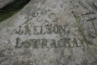
Recently i visited Ilkely, where i came across the cow and calf rocks, a large rock formation consisting of an outcrop and boulder, also known as Hangingstone Rocks. The rocks are made of millstone grit, a variety of sandstone, and are named cow and calf because one is large, with the smaller one siting close to it, like a cow and calf.
The fascinating thing about these rocks are what you find when you walk and expore amongst them. Exploring around the area you can find names carved into the stone by previous visitors with the earliest being from the early 1800.
The rocks show what human endever can create. People have worked hard to leave their personal mark, creating a lingering moment carved in stone. The carvings change the normal surroundings of the rockface creating integue, interest and history. Left behind is a name, date and birth place, creating a connection between the writer and any viewer after.
Friday, 7 September 2007
Utopia
As i was driving through Norwich yesterday i came across a building completely covered in painted words. There is no information about the project near by so when i got home i looked it up on the internet.
I discovered that the written words are Sir Thomas More’s entire novel ‘Utopia’. The old Eastern Electricity building was due for demolition and inspired local artist Rory Macbeth to paint his favourite novel on its exterior walls for the EASTinternational 2006 contemporary art exhibition. He said his reason for painting Utopia onto the building is that the novel is “as valid now as it was when it was written”.
“I like expressing the text through graffiti,” he explained, “as most graffiti is utopian – the world would be perfect if this or that were different.”
The building is incredibly visually striking creating a sense of mystery and intrigue. You can see from standing near the building that the decoration is written words but you cannot make out each individually, making it impossible to derive any meaning from them.
Thursday, 6 September 2007
Macmillan Cancer Research
I have seen a lot of advertising recently for Macmillan Cancer Support using positive and bold graphics and typography to make them stand out from other charities. When I looked into the charity in more detail I realised that this brand identity had only been around since 2006.
The charity was founded, as the Society for the Prevention and Relief of Cancer, in 1911 by Douglas Macmillan following the death of his father from the disease. In 1924 the name was changed to the National Society for Cancer Relief, which it retained until 1989 when it was changed to Cancer Relief Macmillan Fund, later changed again to Macmillan Cancer Relief. From 5th April 2006 Macmillan Cancer Relief became known as Macmillan Cancer Support as this more accurately reflects its role in supporting people living with cancer. It has adopted the principles of being a 'source of support' and a 'force for change'.
The re-branding has been extremely successful and works on a variety on media. Despite their boldness the designs always have a human, hand-made feel to them, which suggests the approachability of the charity. The main message of the promotional media always stands out, nothing is decretive and fussy. The designs are always simple and straight to the point, with each image or piece of type there for a clear reason.
Words Fail Me
A witty and imaginative look at the contradictions and inconsistencies in the English language. Designer and typographer Teresa Monachino demands a second look at hidden meaning in a superficially simple word. The book 'Words Fail Me' uses clever visual representations to create an entertaining and beautifully presented look at nonsense within the English language.
Why is abbreviation such a long word? Does monosyllabic really need five syllables? Why is lisp so hard to say if you have one? 'A book that gently subverts and questions the art of expression...filled with gentle humour and genuinely interesting anachronisms of the English language, all set in Monachino's immaculate typography.'(Design Week)
Did you know that the letters of HONESTLY can be rearranged to read ON THE SLY? A FUNERAL is also REAL FUN and SANTA can easily be turned into SATAN?
The concept of the book was inspired by Monochino's Sicilian mothers uncertain grasp of the English language "In my attempts to explain the often extreme differences in meaning between similar-looking words I often found myself equally befuddled. English hoodwinks us into believing one thing while concealing something quite different. All is not what it seems. This book is my attempt to bring these illogical ideas to the fore, not as an academic study of our language, but as a visual treat.”
Wednesday, 5 September 2007
BeniFit package design
Benefit’s unique package design and marketing approach have set it aside for other cosmetic companies. BeneFit cosmetics are beautifully imaginative and utilize a fanciful illustration style and bold typography to communicate a brand personality built around the ideas of imagination, free-spiritedness and individuality. The photos and graphics used on the packaging also help contribute to the brand’s playful image.
Unlike many other cosmetic brands, which rely on a very consistent packaging look and feel, BeneFit differentiates itself by building stories around individual products like Dear John facial cream and Bad Gal Lash. They have created an element of surprise and discovery around each product. All have attention-grabbing names, such as Ooh-La-Lift under-eye depuffer and High Brow. These witty, catchy names and vibrant, evocative imagery create a distinctive brand experience that costumers want to buy into.
Benefit was founded in 1991 by identical twin sisters Jean and Jane Ford. They opened their first boutique, The Face Place, in 1976 in San Francisco and quickly opened another three. Their buisness expanded mostly because of their product "Benetint" and in 1991 the company began national distribution and the name was replaced with one that best reflected the intent of the products…Benefit.
Tuesday, 4 September 2007
Overtake Faster
A series of outdoor print adverts for VW Golf R32. The campaign copy reads 'Overtake faster' and shows images of lorries and coaches which cars often get stuck behind on busy roads. The cars appear a lot shorter then usual, suggesting that WV is so fast, that when you overtake, other cars look smaller.
Subscribe to:
Posts (Atom)